
client
AQblue Ltd.
role
Visual Identity
Brand Application
Print & Digital Design
Web design
WEB DEVELOPMENT
timeline
2015 - 2020
The Context
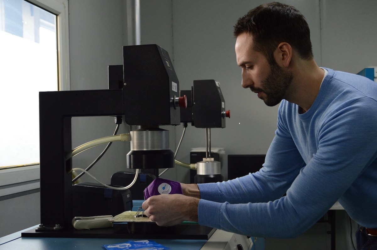
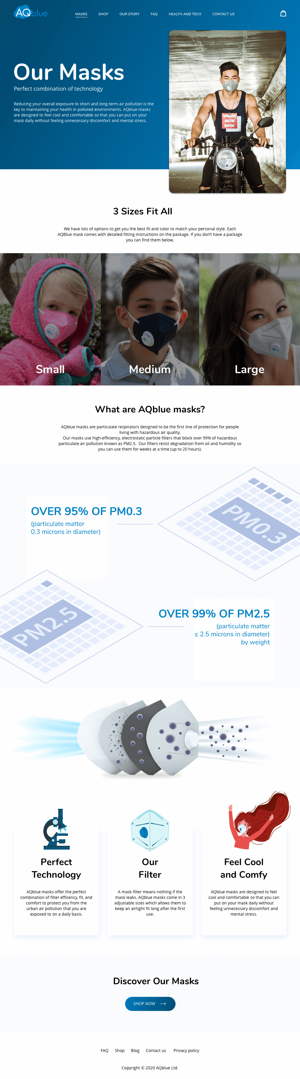
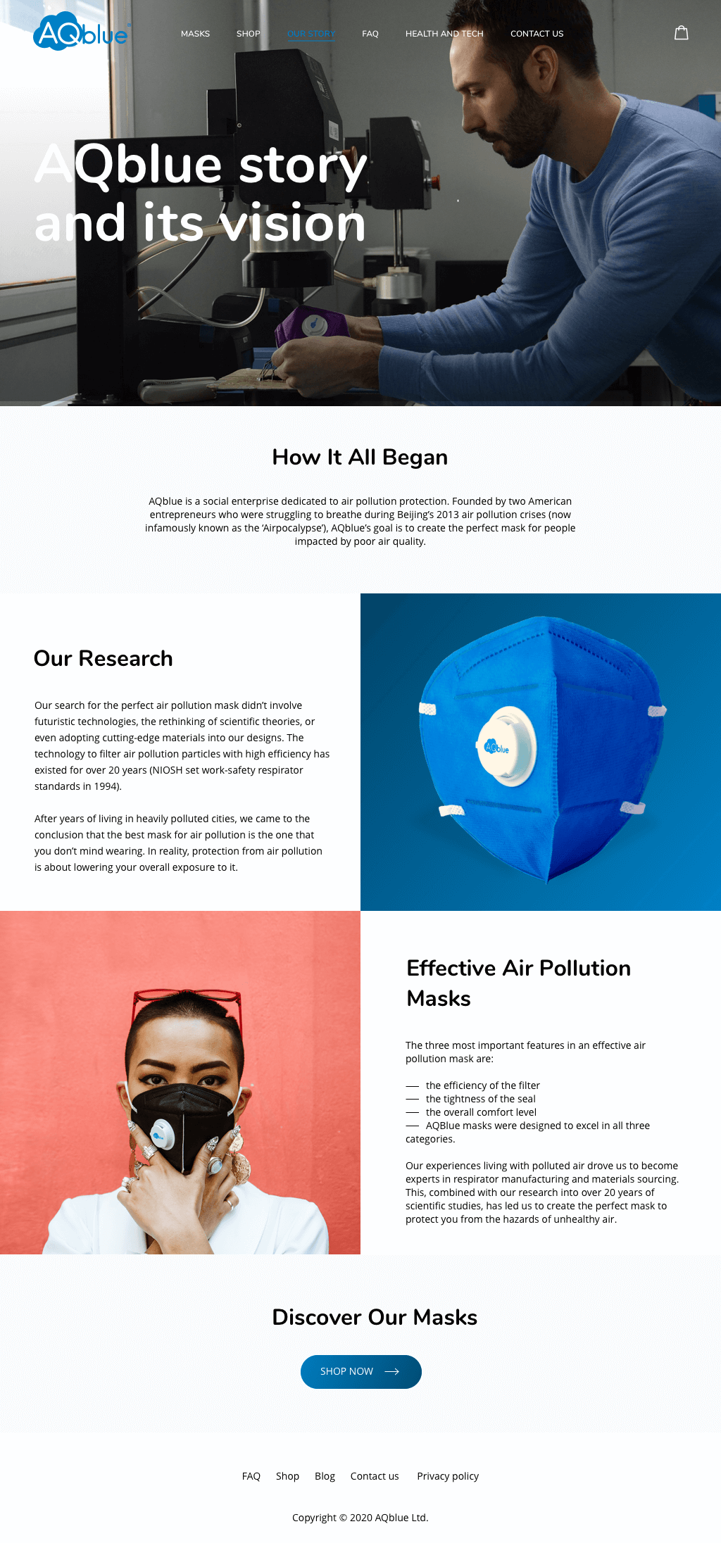
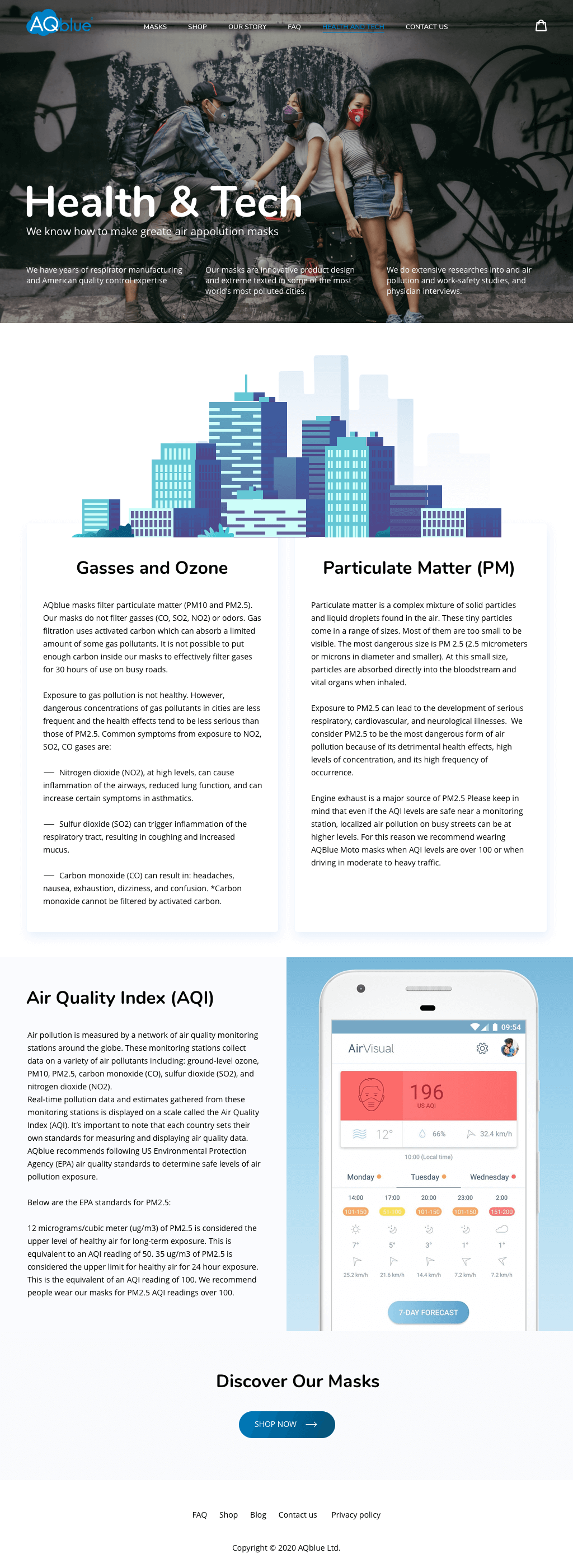
AQblue is a social enterprise dedicated to air pollution protection. Founded by two American entrepreneurs who were struggling to breathe during Beijing’s 2013 air pollution crises (now infamously known as the ‘Airpocalypse’), AQblue’s goal is to create the perfect mask for people impacted by poor air quality.
Working with AQblue started with its beginning. The aim was to create a unique visual style that would reflect the brand’s values and authenticity.
Logo
The logo consists of two capital letters AQ, the acronym for Air Quality, which should be white or transparent.
AQ ideally fit into a blue cloud that represents air, atmosphere. Blue cloud is connected with blue.
The logo shows perfect and light composition. Every element of the logo supplements each other.o the whole logo.
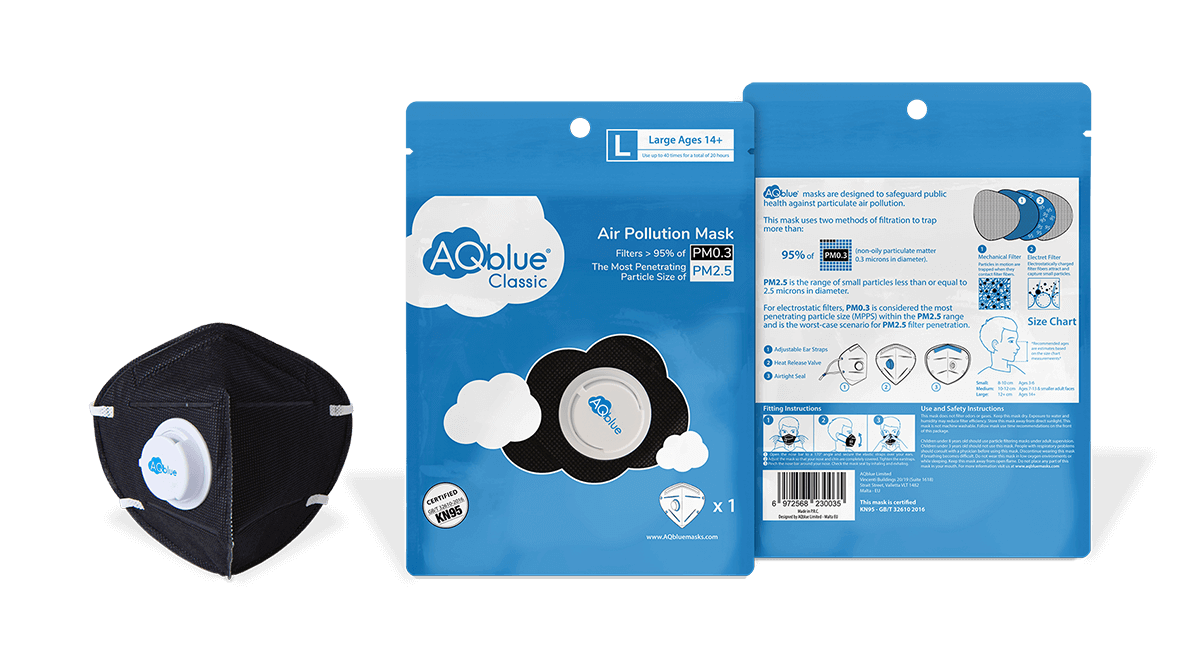
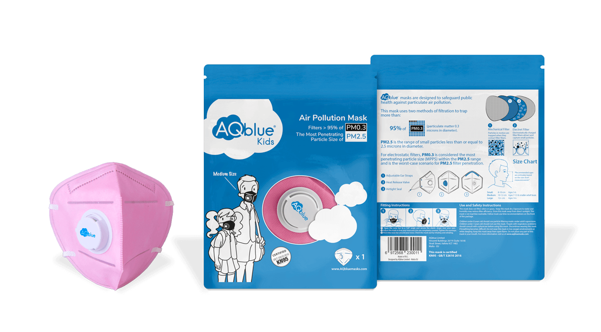
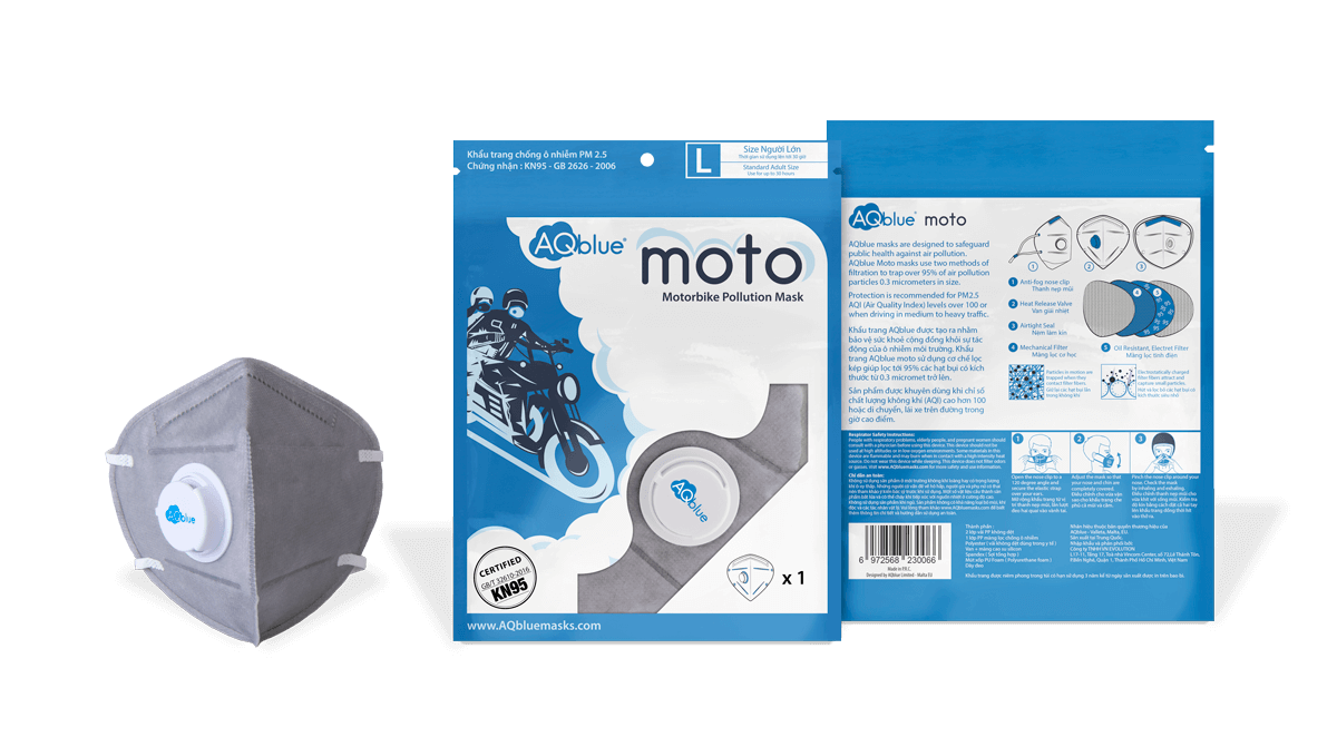
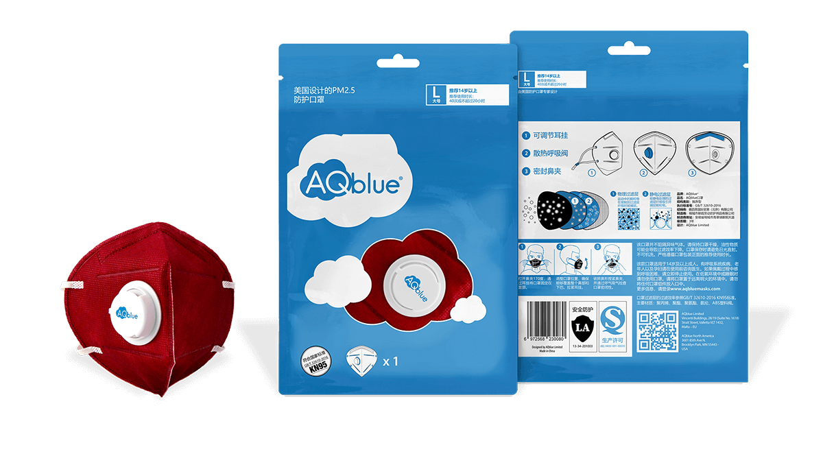
PACKAGING
Several packagings for different AQblue products, they include: 7/11 special packaging, AQblue plus - large, small, and mediium packagings, AQblue classic packaging, AQblue MOTO packaging.
All products have different target audience and different porpuoses.
typography


colors
#ffffff
#f4f7fc, #eceff3
#0e6d9e, #0081c5
#000000
pages
Other Works
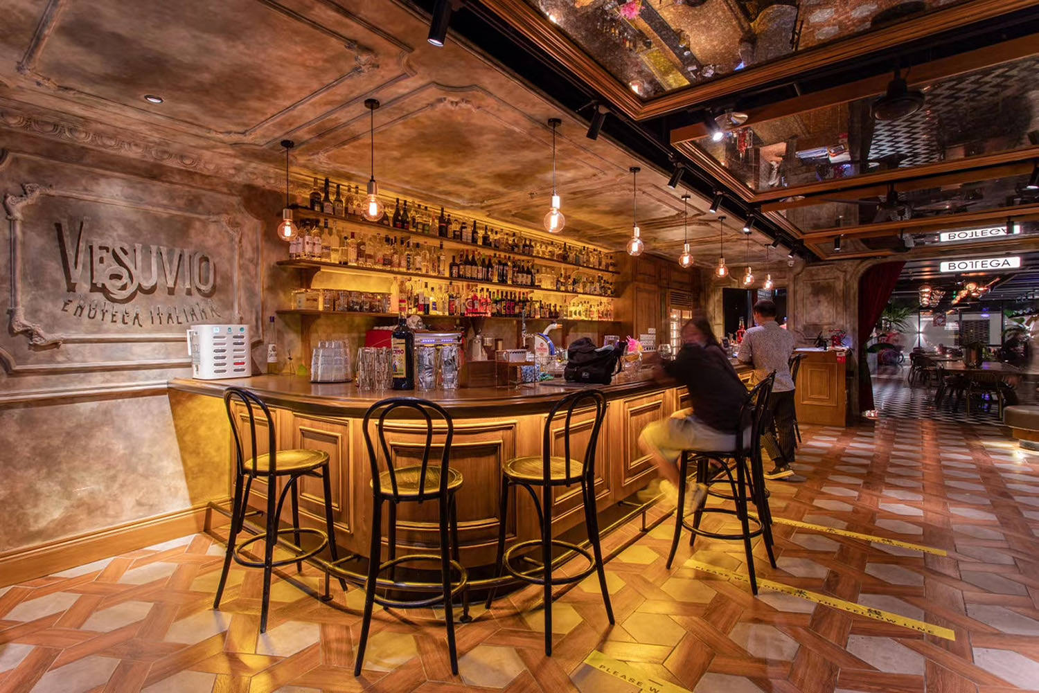
VesuvioEnoteca Italiana
Āustabawingi tautāProject type
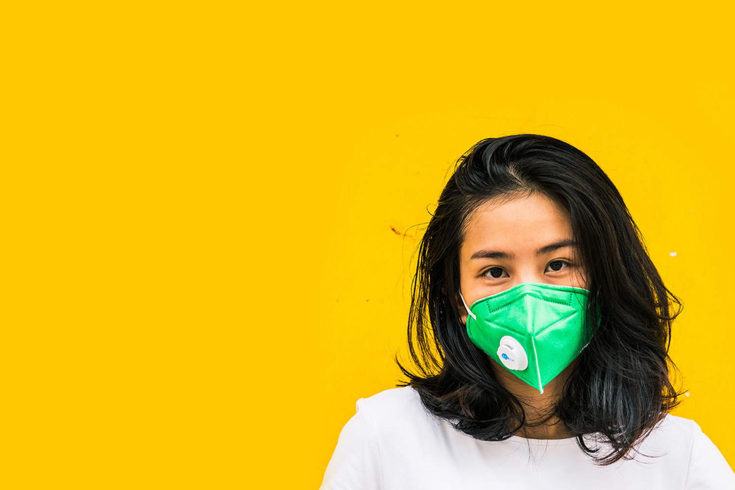
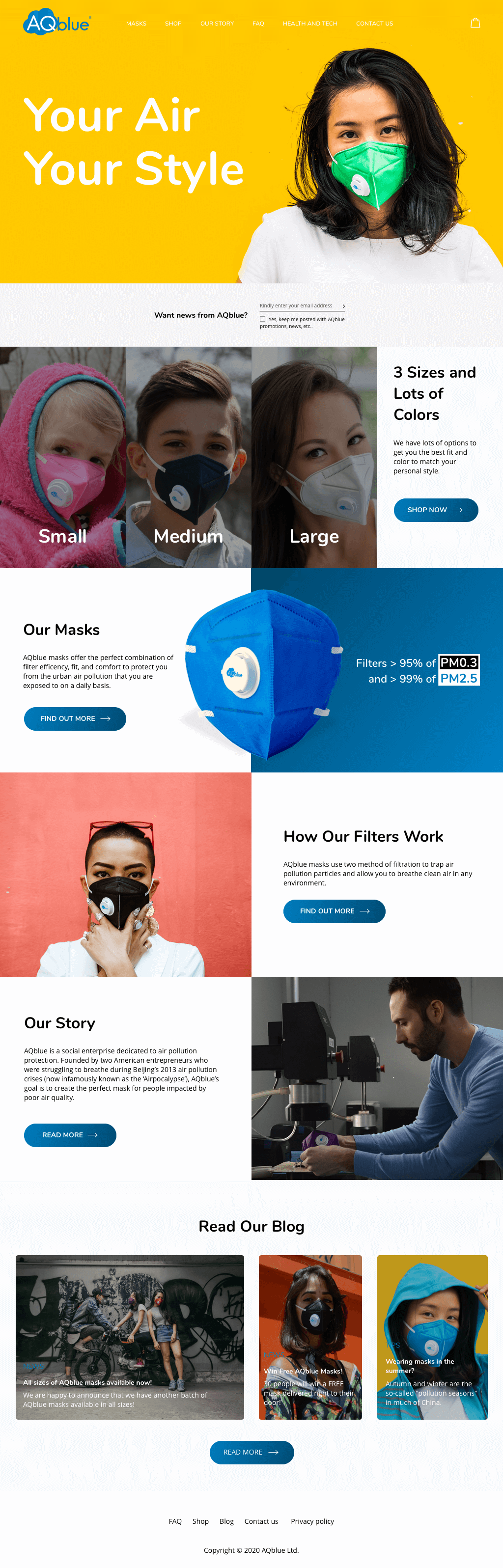
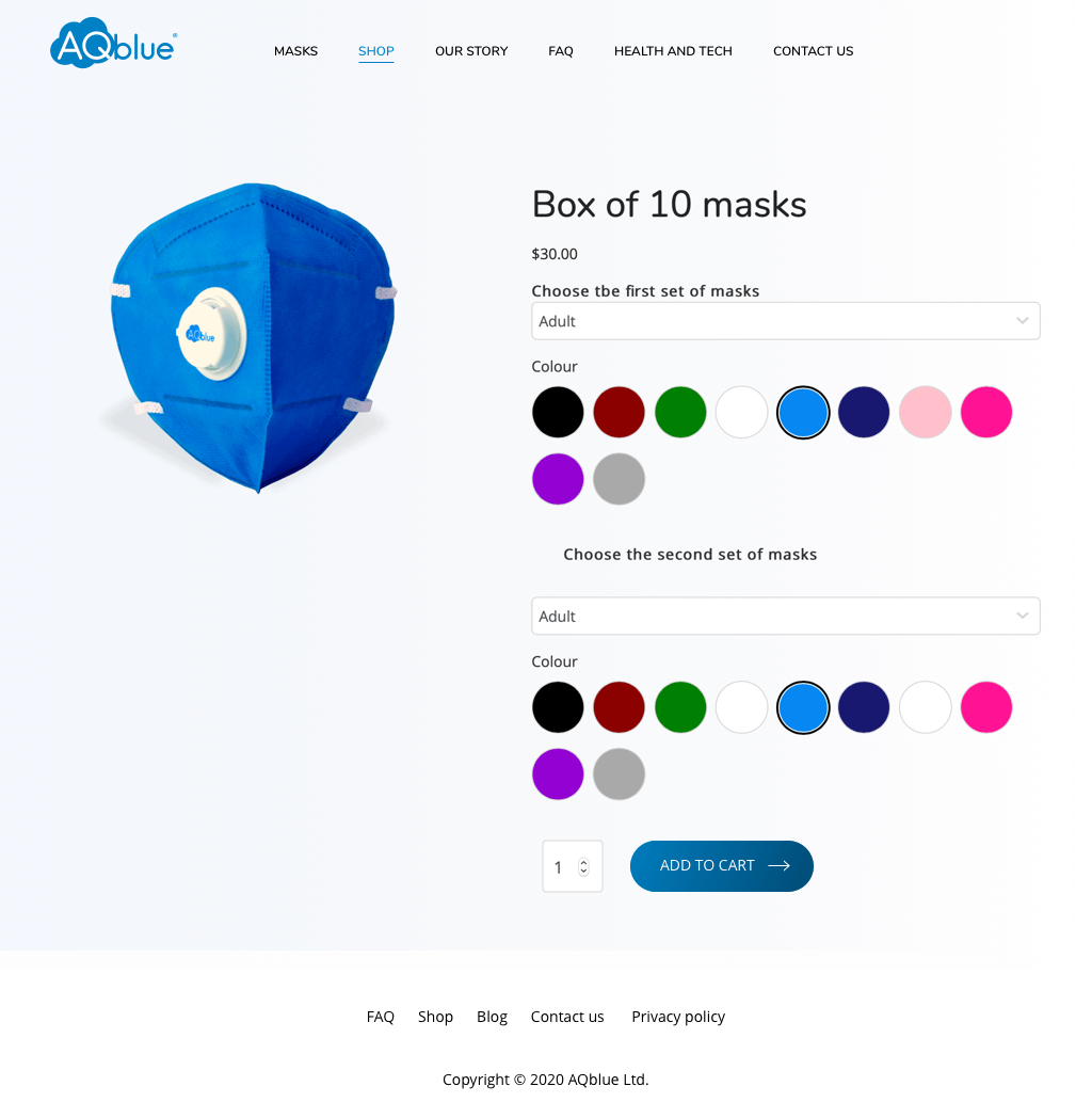
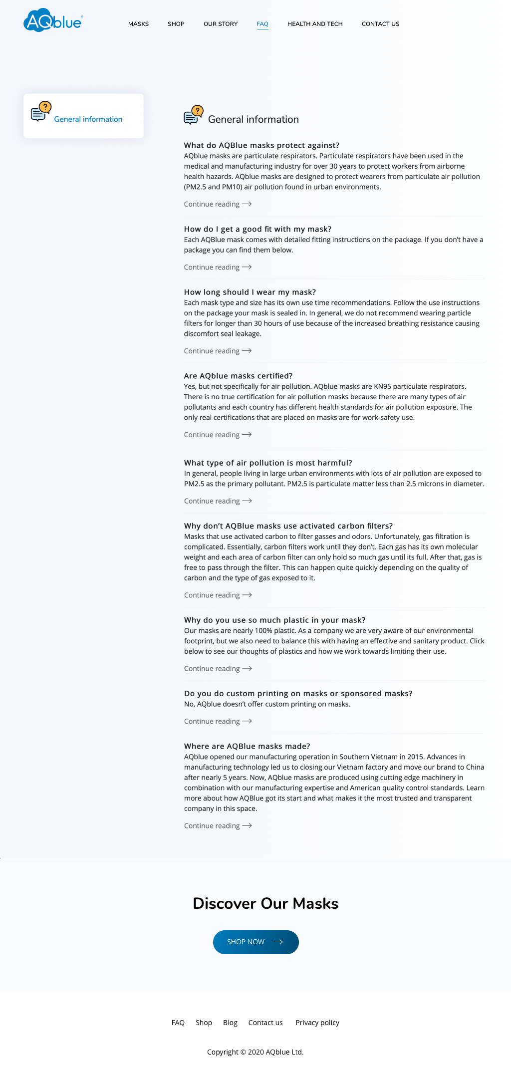
AQblueYour air, your style
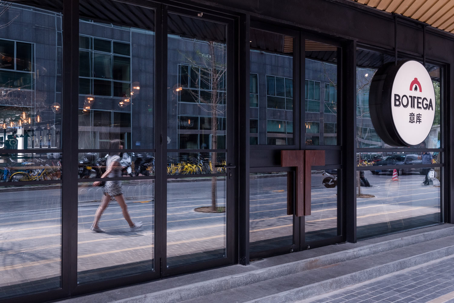
BottegaHearty Neapolitan pizzas in Beijing
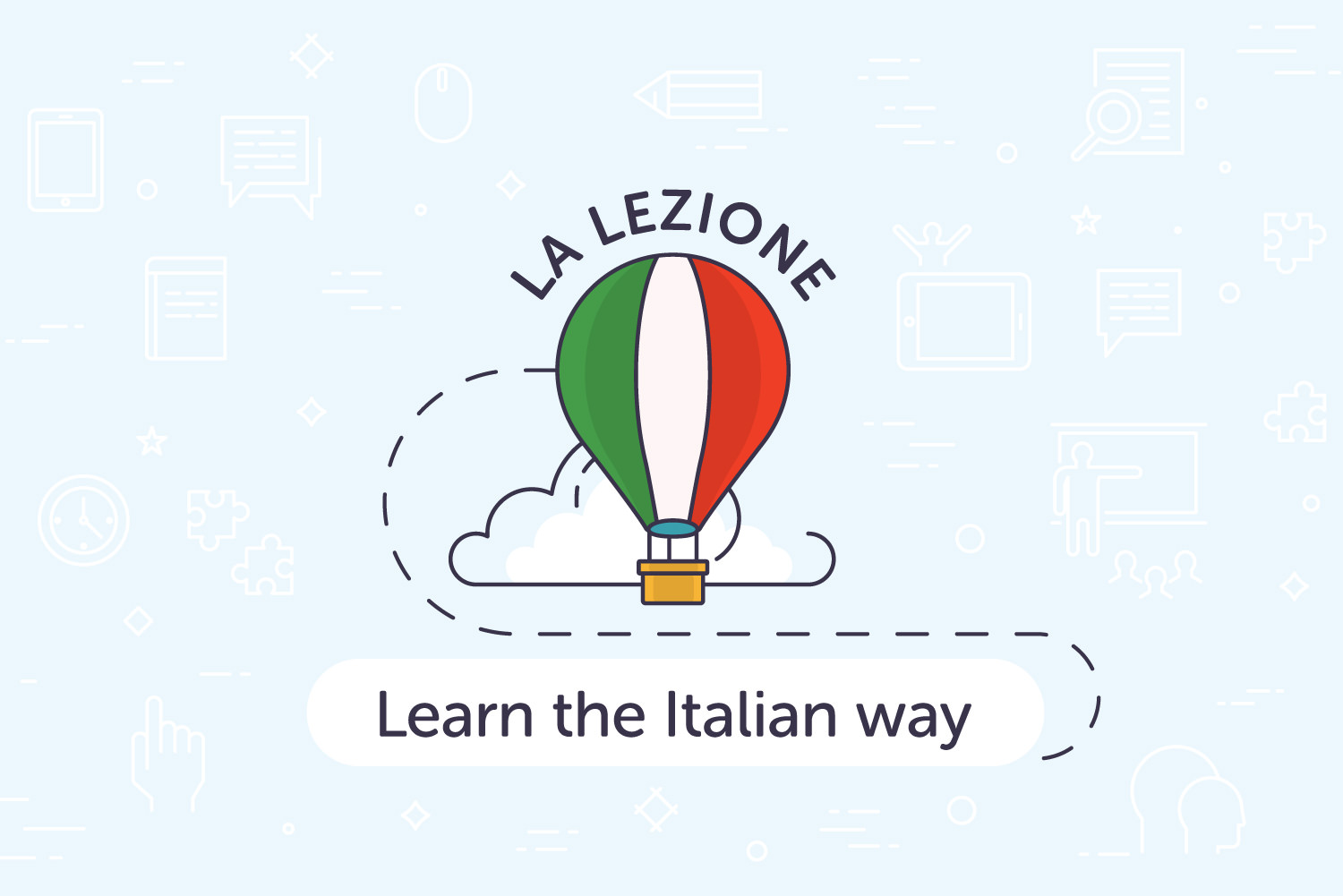
La LezioneLearn the Italian way

BlockflixCreate. Share. Earn. Watch without ads

El BarrioFiesta siesta tequila repeat

BilāPrūsiska bilā, stwi be teinū
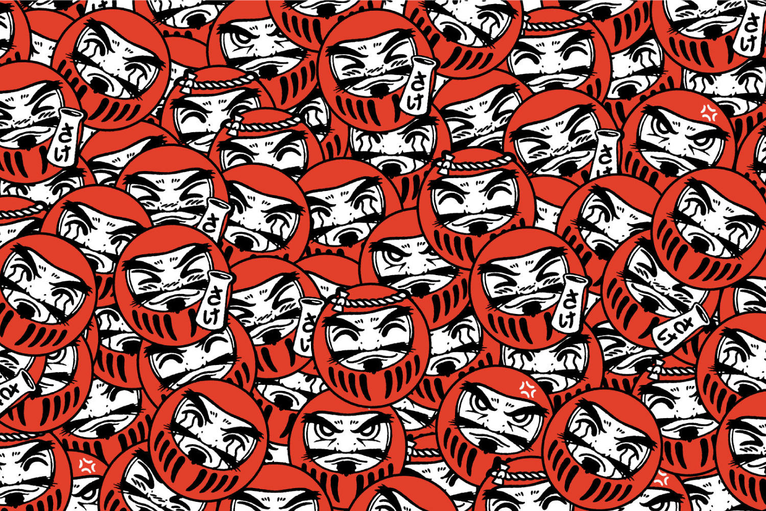
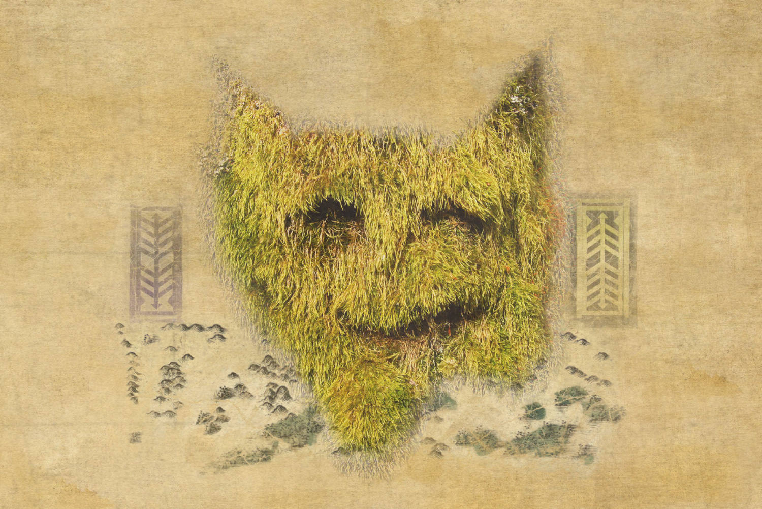
DarumaStart your Japanese experience here
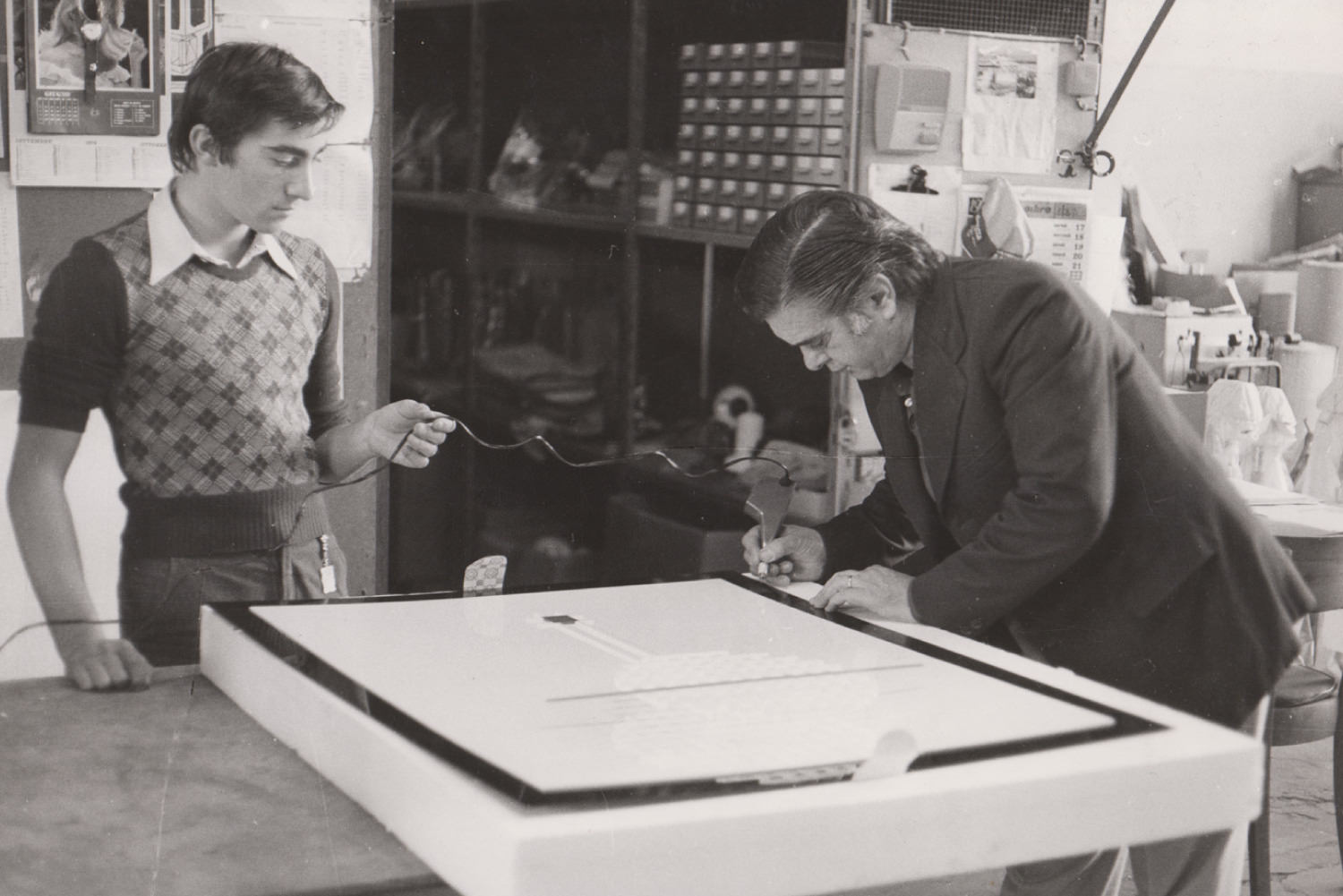
ArserArt multiples. Since 1974
Salon20Beauty experience like no other
Romowe RikoitoMagic Prussian journey
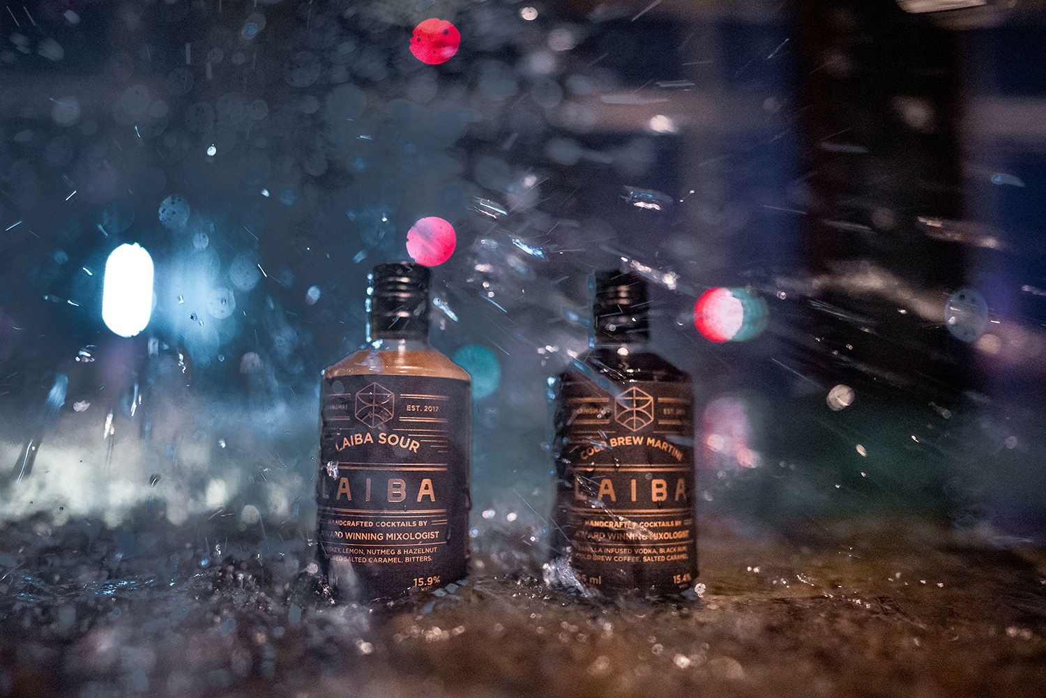
LaibaBrining the bar to you
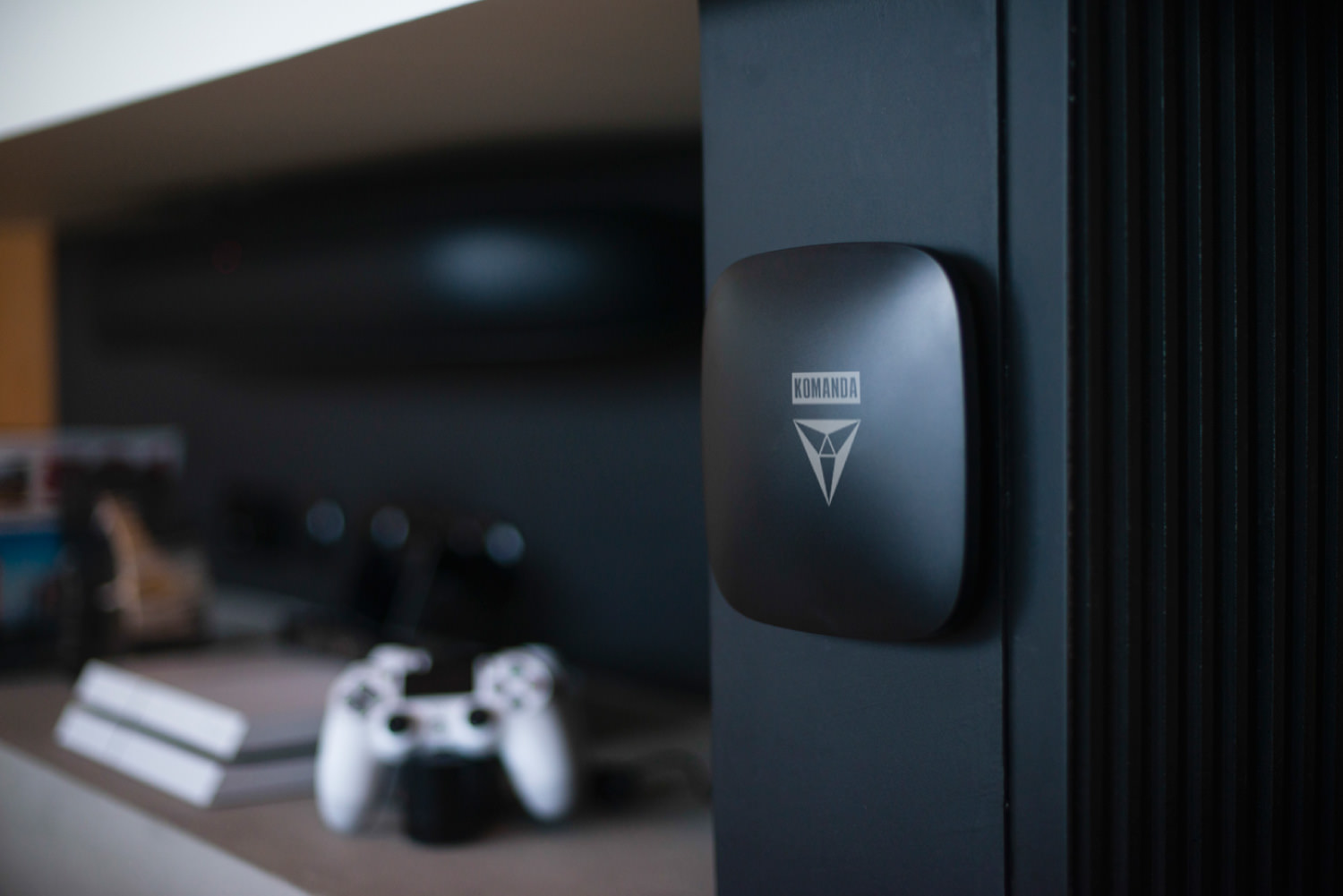
KomandaeCommerce sollution
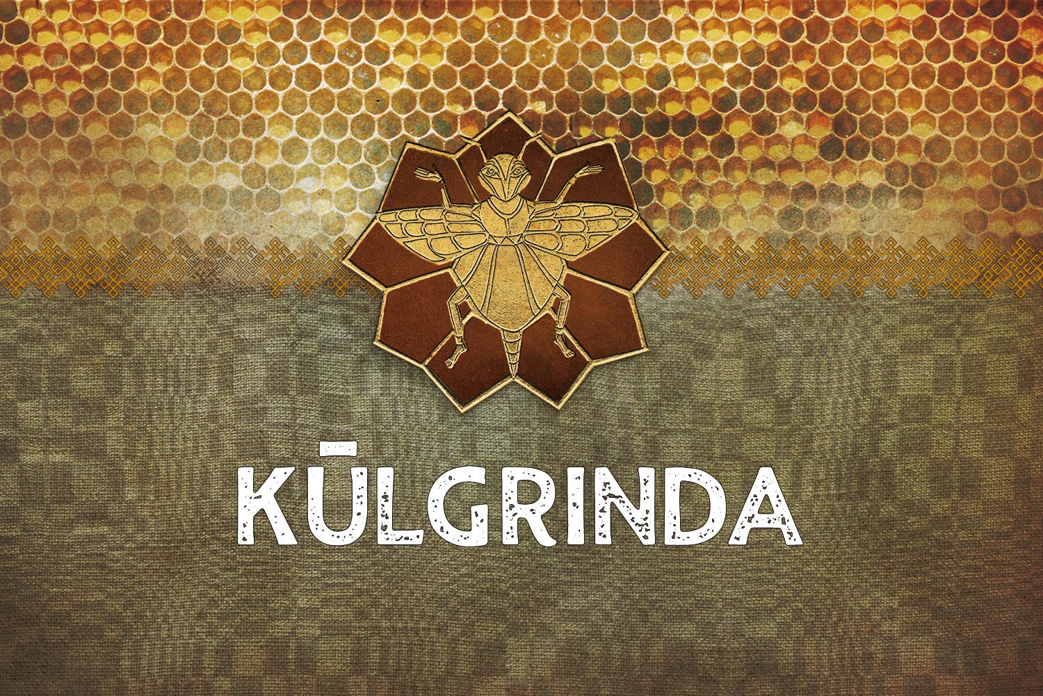
KūlgrindaProject type
© 2024 RANTAWA